
I give an example, I have a panelGrid with layout = "grid", I use the colummnsClases attribute to give a specific width by percentages to all the columns. When I visualize in a mobile the app, primefaces crushes the style that I have put in the columnsClasses and applies the responsive with version 6.1, but in version 6.2 the inserted in the columnClases attribute prevails and the responsive mode is not applied.
Example:
CSS:
Code: Select all
.ancho10{
	width: 10%;
}
.ancho40{
	width: 40%;
}
.ancho100{
	width: 100%;
}
Code: Select all
<p:panelGrid columns="4" layout="grid" styleClass="ancho100" columnClasses="ancho10,ancho40, ancho10, ancho40">
	<h:outputLabel value="Provincia:"/>
	<p:selectOneMenu styleClass="ancho100">
		<f:selectItem itemValue="" itemLabel="SEVILLA" />
		</p:selectOneMenu>

	<h:outputLabel value="Municipio:"/>
	<p:selectOneMenu styleClass="ancho100">
		<f:selectItem itemValue="" itemLabel="SEVILLA" />
	</p:selectOneMenu>

	<h:outputLabel value="Tipo Vía:"/>
	<h:outputText value="CALLE DE PRUEBAS LARGA"/>
</p:panelGrid>
Code: Select all
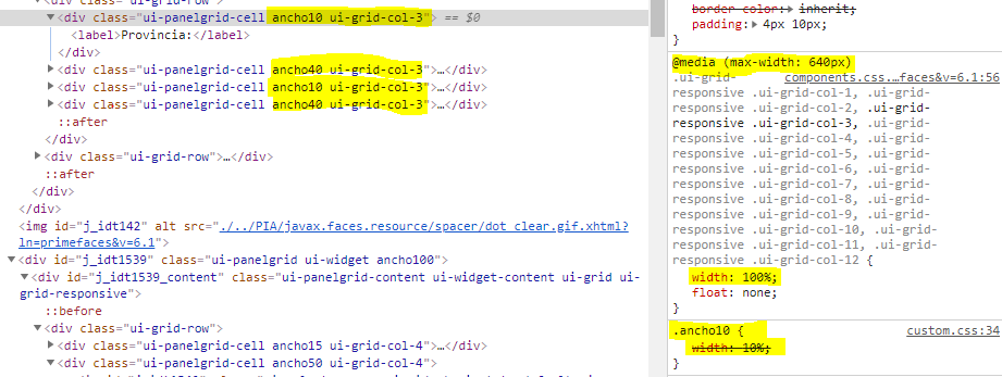
static {
        COLUMN_MAP.put(1, "ui-grid-col-12");
        COLUMN_MAP.put(2, "ui-grid-col-6");
        COLUMN_MAP.put(3, "ui-grid-col-4");
        COLUMN_MAP.put(4, "ui-grid-col-3");
        COLUMN_MAP.put(6, "ui-grid-col-2");
        COLUMN_MAP.put(12, "ui-grid-col-1");
    }
Code: Select all
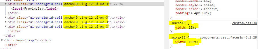
  COLUMN_MAP.put(1, "ui-g-12 ui-md-12");
        COLUMN_MAP.put(2, "ui-g-12 ui-md-6");
        COLUMN_MAP.put(3, "ui-g-12 ui-md-4");
        COLUMN_MAP.put(4, "ui-g-12 ui-md-3");
        COLUMN_MAP.put(6, "ui-g-12 ui-md-2");
        COLUMN_MAP.put(12, "ui-g-12 ui-md-1");
PF 6.1 Work Example
Mode Normal

Mode Responsive

CSS Responsive
PF 6.2 Dont Work Example
Mode Normal
Mode Responsive

CSS Responsive
How could I correct this problem in order to update PF 6.2?
Thank you so much