Page 1 of 1
Menu bar on Titan on mobile devices shows unaligned entries
Posted: 24 Aug 2016, 12:23
by jcpearce2005
When swithcing to responsive mode on Titan the list of top bar menu items can format in a bunch of unaligned entries, such as below

Is there a way to get them to list in a series like in Spark (below), or Omega,
Thank you.
Re: Menu bar on Titan on mobile devices shows unaligned entr
Posted: 24 Aug 2016, 15:50
by mert.sincan
Can you please attach your topbar.xhtml for us to replicate?
Re: Menu bar on Titan on mobile devices shows unaligned entr
Posted: 26 Aug 2016, 19:14
by jcpearce2005
Yes of course, thank you
I notice that the spark layout.js is around three times the size (20k) vs Titan's layout.js and I wonder if the differentiation is in there.
Code: Select all
<ui:composition
xmlns="http://www.w3.org/1999/xhtml"
xmlns:f="http://java.sun.com/jsf/core"
xmlns:h="http://java.sun.com/jsf/html"
xmlns:ui="http://java.sun.com/jsf/facelets"
xmlns:p="http://primefaces.org/ui">
<!-- TOPBAR -->
<div id="layout-topbar">
<!-- LOGO -->
<a href="index.xhtml" id="logo">
<p:graphicImage name="images/logo.svg" id="forFlying" library="titan-layout" />
<p:graphicImage name="images/logo.svg" id="forFixed" library="titan-layout" />
</a>
<!-- MENUBUTTON -->
<a id="menu-button"> <i class="icon-chevron-down"></i> </a>
<!-- SEARCH -->
<!-- TOPBAR LINKS -->
<a id="topmenu-button"> <i class="icon-list2"></i> </a>
<ul id="topbar-menu">
<li><a href="https://osiitservices.com/osi/faces/prv/index.xhtml"><i class="fa fa-sign-in" style="color: #046b99;"></i> Log In</a></li>
<li><a href="testimonials.xhtml"><i class="fa fa-quote-left" style="color: #046b99;"></i> Testimonials</a></li>
<li><a href="#"><i class="fa fa-mobile-phone" style="color: #046b99;"></i> The digital advantage</a></li>
<li><a href="locations.xhtml"><i class="fa fa-street-view" style="color: #046b99;"></i> Locations</a></li>
<li><a href="#"><i class="fa fa-group" style="color: #046b99;"></i>Specializations</a></li>
<li><a href="signup.xhtml"><i class="fa fa-pencil-square-o" style="color: #046b99;"></i> Signup</a></li>
<li><a href="contact-us.xhtml"><i class="fa fa-comments-o" style="color: #046b99;"></i> Contact us</a></li>
<li><a href="pricing.xhtml"><i class="fa fa-dollar Fs18 " style="color: #046b99;"> </i> Pricing</a></li>
<!--
<li>
<a class="Animated05 CursPointer"><i class="fa fa-user"></i> Welcome Hoe <i class="fa fa-chevron-down Fs14 Fright ShowOnMobile"></i></a>
<ul style="width:175px; margin-left:-10px;" class="Animated03 submenu">
<li><a class="Animated05"><i class="fa fa-user Fs30 Fleft"></i> <span class="Fright Fs20 TexAlRight"><span class="Fs10 DispBlock">
</span></span></a></li>
<li><a href="mypendingtasks.xhtml" class="Animated05"><i class="fa fa-suitcase"></i>Open Tasks </a></li>
</ul>
</li>
-->
</ul>
<!-- MENU COVER -->
<div id="layout-menu-cover">
<ui:include src="layoutmenu.xhtml" />
</div>
</div>
<!-- TOPMENU -->
<ul id="top-menu" class="MarBot30">
<li class=" ">   .. </li>
</ul>
</ui:composition>
Re: Menu bar on Titan on mobile devices shows unaligned entr
Posted: 29 Aug 2016, 16:07
by jcpearce2005
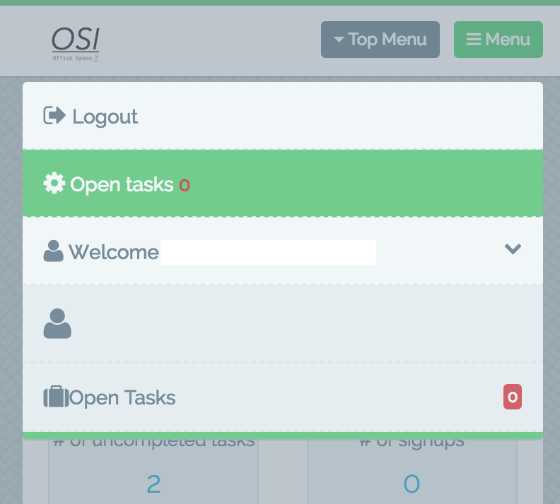
Also with Titan I am unable to add a submenu item to the menu bar, in Spark it works well and looks like
Code: Select all
 <li>
                        <a class="Animated05 CursPointer"><i class="fa fa-user"></i> John DOE, Welcome <i class="fa fa-chevron-down Fs14 Fright ShowOnMobile"></i></a>
                    <ul style="width:175px; margin-left:-10px;" class="Animated03 submenu">
                        <li><a class="Animated05"><i class="fa fa-user Fs30 Fleft"></i> <span class="Fright Fs20 TexAlRight">John DOE<span class="Fs10 DispBlock">Last login 18:50</span></span></a></li>
                        <li><a href="#" class="Animated05"><i class="fa fa-dashboard"></i> My Profile</a></li>
                        <li><a href="#" class="Animated05"><i class="fa fa-magic"></i> My Settings</a></li>
                        <li><a href="#" class="Animated05"><i class="fa fa-suitcase"></i> Tasks <span class="notification-bubble BordRad3 Fright">24</span></a></li>
                        <li><a href="#" class="Animated05"><i class="fa fa-quote-right"></i> Notifications <span class="notification-bubble BordRad3 Fright">18</span></a></li>
                    </ul>
                </li>
The demo does not have any submenu's and when trying to add them in a similar manner in Titan the submenu items show up without opening up the drop down. These two menu issues; unaligned entries on mobile, and no drop down are the only things holding me up, otherwise primefaces rocks.
Re: Menu bar on Titan on mobile devices shows unaligned entr
Posted: 02 Sep 2016, 19:57
by jcpearce2005
Any ideas, progress?
I've bought another theme, the newest Ultima, but for this application Titan is still the best purchase I've made and I'd like to get it to work.
Thank you.
Re: Menu bar on Titan on mobile devices shows unaligned entr
Posted: 08 Sep 2016, 14:57
by mert.sincan
First issue; What is the height and width of logo.svg?
Second issue; Titan doesn't support nested topbar item like topbar of spark.
Re: Menu bar on Titan on mobile devices shows unaligned entr
Posted: 08 Sep 2016, 15:18
by mert.sincan
For first issue, please try;
Code: Select all
<style type="text/css">
    .FlyingTopbar #menu-button,
    .FixedTopbar #menu-button{
          margin-left: 150px; /* you can change this value according to width of your logo */
    }
    #logo {
         position: absolute;
         left: 14px; /* you can change this value according to your logo */
         top: 16px; /* you can change this value according to height of your logo */
    }
</style>